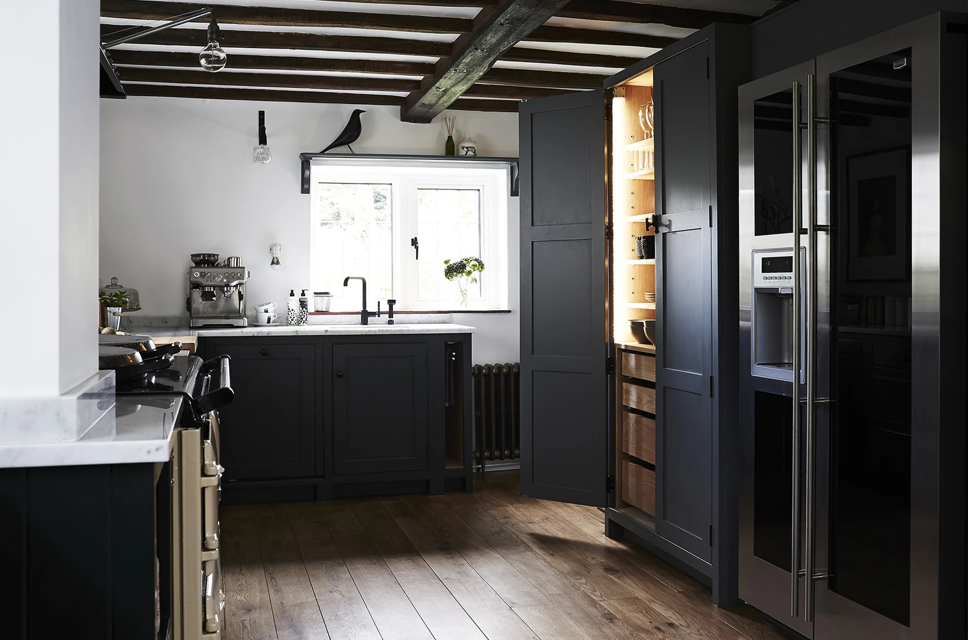
Sympathetic Renovation of a 250 Year Old Kitchen
Alresford based Interior Design Studio, Fawn Interiors share with us one of their projects. It's clear to see how the hard work paid off - and led to a well deserved award.
When we first viewed this kitchen and took the brief, we knew it would be quite a challenge. The existing kitchen was over thirty years old and ‘shabby chic’ and the owners had been looking at beautiful inspiration images from Plain English and deVOL kitchens. They seemed a million miles apart!
The brief was simple – respect the existing rustic architecture but add in modern conveniences; the only appliance that had to stay was the lovely electric Aga, the rest we had free rein on. A handmade Shaker-style kitchen was decided upon, and luckily the room is triple-aspect (and flooded with light despite the lower ceilings), so we could go for a darker colour scheme to look more modern. Then the slight stumbling block…no overhead central lighting because of the beams. How were we going to light the room overall without a central light? Luckily we hit upon the idea of industrial-style wall lights with elongated arms, so that you can control the position (and therefore direction) of the light.
With all of this in mind, we moved onto the mood-board, so necessary to align tastes. With colour schemes and fixtures and fittings decided, we designed the layout to accommodate lots of storage with larder units being top of the list. There is a crockery larder, a small food larder for daily use and, around the corner, a large food larder with microwave to save countertop space. Because of these larder units, we were able to forgo wall cabinets for an overall more streamlined look. We added appliances into the plan – an integrated dishwasher (no one really wants to look at them), but a freestanding fridge freezer with ice and water dispenser, which the children love. To continue the industrial vibe that we started with the lighting, we added the Aga cooker hood, the black sink, and black taps to the sourcing list. It was all coming together…on paper.
When we started the actual renovations, we hit some snags with uneven flooring and walls and the plaster took longer to dry than anticipated because of the thick flint walls. But after some careful levelling of the floors and slightly extended drying time, we were ready for the ultimate finishing touch – the marble work surface. Now most stone suppliers will warn against marble but we specified a polished version (rather than honed) so that it can be restored and polished every couple of years. It’s a bit of hard work but worth it for a luxury look and feel. The oak floors that were already there were kept and we had them sanded and oiled for a really rich finish and we hung fashion photography prints to complete the eclectic feel. The final part of the process for us was to style and photograph it, which is always the best bit as it’s when you see your vision come to life fully.
When the opportunity arose, we entered the project into the Remodelista Considered Design Awards. We were up against some tough competition, like the aforementioned deVOL Kitchens and Border Oak, so didn’t think much of it. Then we found out we were finalists – we felt hopeful but the competition was still stiff. We were on holiday when we checked our emails (having put aside the poolside cocktails) and discovered we had won! The cocktails were promptly replenished, of course.
Even without the award, it’s a project we are really proud of and we hope you like it too!
We think you will all agree that this project was well worthy of winning the award! If you would like to find out more about Fawn Interiors and see more of their incredible work - head over to their website or follow them on Instagram, Facebook or Twitter.


